The Pagemaster
+2
ccchesley
akiurameshi
6 posters
Page 1 of 1
 Re: The Pagemaster
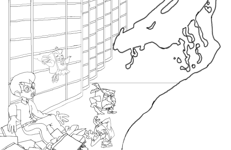
This is looking great. I think you chose a great scene and the composition is pretty nice. I drew over the kid really roughly to make his pose seem a bit more fluid. I also noticed his arm was a bit long. I think it's a small change and it still keeps your original gesture. Remember that sometimes keeping it simple can go a long way.


 Re: The Pagemaster
Thanks for the feed back.
akiurameshi- Intern
- Posts : 7
Join date : 2013-03-07
Age : 36
Location : Draper,Utah
 Re: The Pagemaster
Good stuff! This will be a good challenge. Just two small notes. All the characters seem to be looking in different directions. And the monkey character is about to fall off the bottom of the page. Can you raise him a bit? Can't wait to see more!
 Re: The Pagemaster
I agree with Amie. You should have all the characters looking at the villain since it's the most important thing in the picture. Also tilt the monster down more so that it looks like he is looking at the characters.
It's looking great so far
It's looking great so far
 Re: The Pagemaster
I love this movie soo much!!
One note from me aside from the eye direction, if you plan on working with the line art, line quality is really important for defining things, thick vs. thin lines are key.
If your not, than never mind . Can't wait to see what you do with it.
One note from me aside from the eye direction, if you plan on working with the line art, line quality is really important for defining things, thick vs. thin lines are key.
If your not, than never mind

MicAfropuff- Keep'n it reel
- Posts : 25
Join date : 2013-03-06
Age : 31
Location : Salt Lake City, Utah
 Re: The Pagemaster
I would say bake the room more discombobulated. Throw more books on the ground, put some of the book shelves on an angle. I would also put shadows on the ground under the book cases so that it will add weight to the image 

DragonRider- Side Kick
- Posts : 12
Join date : 2013-03-06
Age : 38
Location : Sandy, UT
 Re: The Pagemaster
Were you going to fix some of the line work that has been suggested? Just wondering. This is your picture, you can take or leave whatever is suggested. But if you aren't I'd like to know why you choose not to.
I've never watched this show (though I have seen it around). Is this a dream type world? The reason I ask is because that's how the scene is coming across. If its reality then you need to use perspective on the background objects. aka shelves, books, and floor pattern.
I've never watched this show (though I have seen it around). Is this a dream type world? The reason I ask is because that's how the scene is coming across. If its reality then you need to use perspective on the background objects. aka shelves, books, and floor pattern.
 Re: The Pagemaster
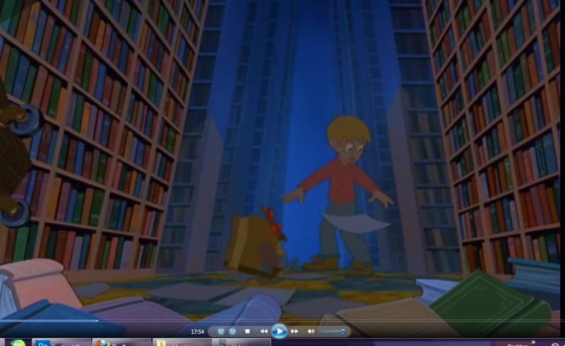
Hey brittany, This is looking good. I like that you're sticking to the original color palette. I took a snap shot from the actual film, though I'm sure you're already looking at it for reference. But I just want to note that one of the things that's so great about the film is that the backgrounds are so wonderfully done,  .
.
One thing that could really help your focal point (your characters, I'm assuming) is notice how as the bookshelves head toward the background the colors start to fade into more neutral colors, and eventually into the blue. Hope this helps Keep up the awesomness!
 .
. One thing that could really help your focal point (your characters, I'm assuming) is notice how as the bookshelves head toward the background the colors start to fade into more neutral colors, and eventually into the blue. Hope this helps

MicAfropuff- Keep'n it reel
- Posts : 25
Join date : 2013-03-06
Age : 31
Location : Salt Lake City, Utah
 Re: The Pagemaster
I haven't seen this movie since I was like 5 years old.... Such a beautiful looking film!!!!
Page 1 of 1
Permissions in this forum:
You cannot reply to topics in this forum
 Home
Home

